How to Brand Your Commercial Display Without Overcrowding It

Projection House


Branding a commercial display is both an art and a strategy. It’s about making your brand instantly recognizable—without overwhelming the viewer. A well-designed commercial display solutions should attract attention, communicate clearly, and leave a lasting impression.
But when branding goes too far, it becomes cluttered. The message gets lost. The experience feels chaotic. That’s why striking the right balance between visibility and simplicity is key.
In this blog, we’ll walk you through how to brand your display effectively, using clean design and smart strategy.
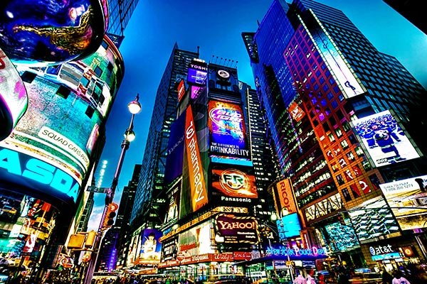
In a retail store, trade show, or showroom, your display competes with dozens—sometimes hundreds—of others. People walk by fast. You only have a few seconds to catch their eye.
A clean, well-branded display stands out. It feels modern. It gives the impression of quality. Most importantly, it guides the viewer’s attention exactly where you want it.
Overcrowded displays do the opposite. Too many messages confuse people. Too much color creates visual noise. And too many logos make your brand look unfocused.
Simplicity builds trust. Clarity builds connection.
Every display should have one goal. Just one.
Are you promoting a new product? Launching a seasonal campaign? Building brand awareness?
When you know your goal, you can shape every design choice around it.
Example: If your goal is product awareness, make the product the hero. Use branding to support—not compete—with the product image.
White space (also called negative space) is the empty area around your design elements. It’s not wasted space—it’s a powerful tool.
White space helps your content breathe. It creates contrast. It makes important elements stand out.
Imagine a sleek boutique display. Minimal words. A strong logo. One bold image. Surrounded by open space. That’s impact.
Tip: Don’t crowd the edges. Don’t fill every inch. Trust that blank space adds strength.
Your brand has many assets: a logo, slogan, font, color palette, and imagery style. But you don’t need to use them all at once.
Choose the most important elements for the setting. Stick to those. Use them consistently.
For example:
Feature your logo in a bold, central spot
Use one brand font for all text
Apply your signature color to borders, accents, or highlights
Keep taglines short and positioned near the logo
This approach builds recognition without clutter.
Color sets the mood and signals your identity. But using too many colors can be distracting and messy.
Choose 2–3 main brand colors. Add neutrals like black, white, or gray to soften the look and provide contrast.
Example: A tech brand might use dark blue, light gray, and white for a modern feel. A wellness brand might use earth tones with a calming green accent.
Consistent color use builds trust and strengthens your visual identity.
Images speak faster than words. A powerful photo or graphic can communicate emotion, quality, and purpose in an instant.
But not all visuals help. Busy, overly detailed, or low-quality images can weaken your display.
Choose visuals that:
Reflect your brand personality
Are high resolution
Have clear focal points
Work well with your color scheme
Leave space for text, if needed
Tip: Use lifestyle imagery to show your product in use. It creates connection and context.
Text is important, but it should be brief. People won’t read long paragraphs on a display.
Focus on a bold headline. A simple value statement. A short call to action.
For example:
“Experience Natural Skincare”
“Fast. Efficient. On Your Terms.”
“Visit Booth #203 for a Free Demo”
Every word should serve a purpose. Use text to guide the viewer, not to tell your whole story.
Final Thoughts: Make Every Element Count
A well-branded commercial display doesn’t need to be loud to be effective. When your message is clear and your design is clean, you make a stronger impression.
Remember:
Define your goal
Limit elements to what’s essential
Use space, color, and imagery with care
Make your brand the focus—but don’t let it take over
Balance is everything.
Read This Also: https://www.hituponviews.com/av-tech-thats-changing-the-way-government-works/
At Projection House, we create custom commercial displays that are built to perform—visually and strategically. From clean layouts to impactful branding, we help you shine without the clutter.
Get in touch today to start designing a display that speaks volumes—without saying too much.